
Introduction to Logo Design Trends
As businesses around the world continue to incorporate various measures to adapt to the new normal that has been forced by the coronavirus pandemic, the probability of logo design being overlooked is very high. But it could be unfavourable for their businesses.
In fact, branding and logos could become even more crucial at the time when consumers will be seeking more trust in brands. In this article, we would explore the logo design trends that could rule in 2021.
Why do logo design trends change?
Like any other graphic design trend, the logo design trends do change every year—more or less. While some new trends fade away every year, new logo design trends emerge, and companies adopt them sooner or later.
And gradually, those trends become common and consequently lose their charm and effectiveness. This leads to the need for a logo design change—from font and colour to geometry. Similarly, the trends change in all spheres.
Businesses need to keep abreast of the logo design trends as the logo is the most critical branding element. If your company’s logo is not attractive and fails to draw your target audiences’ attention, you might lose significant business opportunities.


If you’ve ideas about tour business and precisely know what to put in your logo design, you can use an online logo maker tool or free logo templates by Designhill to create a professional logo on your own. But if you can afford it, it’s better to hire a logo designer or launch a design contest with a creative marketplace like Designhill.
Therefore, you must follow the logo design trends that would rule in 2021. To help you out, we’ve analyzed recent logo design changes of many major companies and prepared a list of top logo design trends for 2021.
Top logo design trends to look out in 2021
Unique Fonts
If you look back, you’ll know how constantly the paintbrushes in logos and graphic design have changed. You might have experienced that many companies adopted a trend of simplification of the logo. But this trend came the time when most text elements started looking alike.
Consequently, companies realized the need for their own typography to give their logos a unique look. In fact, the fonts are the keys to becoming a counterbalance to minimalism in the logo design. You can see companies leaning towards adding abstraction to the fonts for bringing their individuality back.
Motion Design
We’ve been seeing logos as a static image on products and packages as of now. But the trend is changing rapidly with animation and videos becoming an integral part of advertisement over a few years. The trend will become even more prevalent next year with the advancement of technology.
The most exciting thing is that people look at a static logo just for 3 seconds and forget quickly, mix with other images. But when it comes to an animated logo, consumers look at it for several seconds and therefore don’t forget it easily.
No Symmetry
Most companies pay utmost attention to their logo designs, but you can choose to ignore some fundamental rules of logo design. Abstract illustrations offer more space for creative ideas and have started gaining popularity once again.
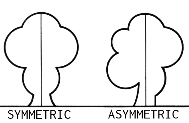
Artists prefer to keep up with the asymmetry when drawing most of the objects. This approach of drawing makes the object look more natural and lively.
Gradients
You might have noticed that gradient as an element of any design has spiked in recent years. And this is mainly because of the advancement of technology that offers more flexibility to use different hues. Gradient, which was the primary pillar of corporate design in the 80s, reemerging today in a modern style.
A gradient in a logo design will mix more and more colors in days to come. Also, different techniques of application of gradient will be used next year. For example, a graphic designer will use:
- Switch between various colours
- Increase and decrease of saturation of one hue
- In fact, the gradient makes a logo look fresh and unique.
Symbolic Shapes & Icons
Symbolism in graphic design is absolutely a fresh trend. However, some major brands like Apple, Nike, and Starbucks have already used symbolic logos for several years. But it’s expected that the work with icons and symbols will become more prevalent in 2021.
Also, you will see symbols clearly blended into the remaining designs.
Big brands will use symbols to let the consumers why they’re specialized in a specific product or service. Designers can integrate symbols and icons in the typography of their logos to get a subtle effect.
Retro Style
The retro design trend is making a gradual comeback. You will see it coming back to almost all spheres of life.
The significant reasons for its comeback are:
- The simplicity of shapes
- Dimmed colours
- Association with the development of new typography, etc.
Due to its exquisite style with the use of fortuitous art stroke, retro logos are anticipated to draw more attention. Modern retro art is actually a combination of old heritage and innovative approaches.
These logos will be more effective in areas such as trade and logistics, coffee shops & pubs, construction & rental business, showrooms and hair salons, etc.
Hand-drawn Logos
With the ever-growing advancement of technology, you can accurately make the effect of a hand-drawn image. Although, small details that make such logos stunning will be lost.
![]()
Hand-drawn illustrations enable the graphic designer to represent the brand idea even more precisely. Hand-drawn logos are best when the company’s scope of activities is associated with restaurant business or entertainment, sports, products or services for kids, etc.
Negative Space
![]()
Designers have well known the advantages of the negative space technique in graphic design for years. They have been applying negative space actively in their design works, and no one has got bored of it even after decades.
Negative space technique can show itself in many ways:
- Creation of ambiguity
- Cross of the letters
- Elimination of separate letter elements, etc.
Negative space underscores the edges of positive space at the very fundamental level. In fact, it helps businesses raise their brand awareness, push the limit of creativity, and provide the logo design with the effect of fun.
Final Thought
Many trends will fade away, and new trends emerge in 2021. The year will be very interesting for both consumers and logo designers. You’ll see plenty of creative illustrations. The change in design trends will set new tasks for companies. Designhill – A reliable marketplace for Logo maker, template design and many other designing work.